


I have found many inaccurate guides to measure the colour and kelvin ratings of HID and LED Lights.
Below are some graphs to show the most accurate scientific data on how colour ratings and kelvin are rated.
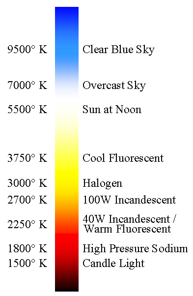
In short, mid-day sunlight rates at about 5770 Kelvin.
Obviously... the sun is also affected by the atmosphere when we judge its colour, but an LED or HID Bulb can be visible as "white" from between approximately 5500k-6000k.
As the kelvin heat rating climbs above 5770 kelvin it moves into the cold spectrum, and the light will become more blue, as it declines below 5770 kelvin it moves into the warm spectrum and will become more yellow.
From experience i have noticed that a 6000k light can appear to have a blue tinge to it when looking directly at it, on the other hand it appears pure white when viewing the light from the drivers seat. Scientists tell us our eyes are best adapted to see the contrast of objects at around Mid-Day sunlight.
Most BMW, Mercedes, and Audi come standard with 6000k, however...some vehicles such as a Honda, and an older Mercedes have 4200k or 4300k (which is a similar colour to the yellow halogen lights you see driving on the road every day).
Some roo shooters prefer 4300k for grey kangaroos, and 6000k for red kangaroos.
We recommend 6000k for standard driving applications, and 99% of our customers buy, and are very happy with, the 6000k colour temperature.
Color temperature is a characteristic of visible light that has important applications in lighting, photography, videography, publishing, and other fields. The color temperature of a light source is determined by comparing its chromaticity with that of an ideal black-body radiator. The temperature (usually measured in kelvins (K)) at which the heated black-body radiator matches the color of the light source is that source's color temperature; for a black body source, it is directly related to Planck's law and Wien's displacement law.
Counter intuitively, higher color temperatures (5000 K or more) are "cool" (green–blue) colors, and lower color temperatures (2700–3000 K) "warm" (yellow–red) colors.
Correlated color temperature
The correlated color temperature (Tcp) is the temperature of the Planckian radiator whose perceived colour most closely resembles that of a given stimulus at the same brightness and under specified viewing conditions
— CIE/IEC 17.4:1987, International Lighting Vocabulary (ISBN 3900734070)[4] Motivation
Black body radiators are the reference by which the whiteness of light sources is judged. A black body can be described by its color temperature, whose hues are depicted above. By analogy, nearly-Planckian light sources such as certain fluorescent or high-intensity discharge lamps can be judged by their correlated color temperature (CCT); the color temperature of the Planckian radiator that best approximates them.
Close up of the Planckian locus in the CIE 1960 UCS, with the isotherms in mireds. Note the even spacing of the isotherms when using the reciprocal temperature scale, and compare with the similar figure below. The even spacing of the isotherms on the locus implies that the mired scale is a better measure of perceptual color difference than the temperature scale.
Because it is the standard against which other light sources are compared, the color temperature of the thermal radiation from an ideal black body radiator is defined as equal to its surface temperature in kelvin, or alternatively in mired (micro-reciprocal degrees kelvin).[1] For source other than ideal black bodies, the color temperature of the thermal radiation emitted from it may differ from its actual surface temperature. In an incandescent light bulb the light is of thermal origin and is very close to that of an ideal black-body radiator.
However, many other light sources, such as fluorescent lamps, emit light primarily by processes other than raising the temperature of a body. This means the emitted radiation does not follow the form of a black-body spectrum. These sources are assigned what is known as a correlated color temperature (CCT). CCT is the color temperature of a black body radiator which to human color perception most closely matches the light from the lamp. Because such an approximation is not required for incandescent light, the CCT for an incandescent light is simply its unadjusted temperature, derived from the comparison to a black body radiator.
The sun
As the sun crosses the sky, it may appear to be red, orange, yellow or white depending on its position. The changing color of the sun over the course of the day is mainly a result of scattering of light, and is unrelated to black body radiation. The blue color of the sky is not caused by black-body radiation, but rather to Rayleigh scattering of the sunlight from the atmosphere, which tends to scatter blue light more than red. This phenomenon has nothing to do with the properties of a black body.
Daylight has a spectrum similar to that of a black body. In professions involving color reproduction, such as photography and publishing, daylight is often approximated using standard illuminant D50 or D65, as recommended by the CIE.
Hues of the Planckian locus, in the mired scale.
For colors based on the black body, blue is the "hotter" color, while red is actually the "cooler" color. This is the opposite of the cultural associations that colors have taken on, with "red" as "hot", and "blue" as "cold". The traditional associations come from a variety of sources, such as water and ice appearing blue, while heated metal and fire are of a reddish hue. However, the redness of these heat sources comes precisely from the fact that red is the coolest of the visible colors, the first color emitted as heat increases.
Color temperature applications
"Color temperature" is sometimes used loosely to mean "white balance" or "white point". However, color temperature has only one degree of freedom, essentially the blue–yellow axis, whereas white balance has two, adding the magenta–green axis.
Film photography
Film sometimes appears to exaggerate the color of the light, since it does not adapt to lighting color as our visual perception does. An object that appears to the eye to be white may turn out to look very blue or orange in a photograph. The color balance may need to be corrected while shooting or while printing to achieve a neutral color print.
Film is made for specific light sources (most commonly daylight film and tungsten film), and used properly, will create a neutral color print. Matching the sensitivity of the film to the color temperature of the light source is one way to balance color. If tungsten film is used indoors with incandescent lamps, the yellowish-orange light of the tungsten incandescent bulbs will appear as white (3200 K) in the photograph.
Filters on a camera lens, or color gels over the light source(s) may also be used to correct color balance. When shooting with a bluish light (high color temperature) source such as on an overcast day, in the shade, in window light or if using tungsten film with white or blue light, a yellowish-orange filter will correct this. For shooting with daylight film (calibrated to 5600 K) under warmer (low color temperature) light sources such as sunsets, candle light or tungsten lighting, a bluish (e.g. #80A) filter may be used.
If there is more than one light source with varied color temperatures, one way to balance the color is to use daylight film and place color-correcting gel filters over each light source.
Photographers sometimes use color temperature meters. Color temperature meters are usually designed to read only two regions along the visible spectrum (red and blue); more expensive ones read three regions (red, green, and blue). However, they are ineffective with sources such as fluorescent or discharge lamps, whose light varies in color and may be harder to correct for. Because it is often greenish, a magenta filter may correct it. More sophisticated colorimetry tools can be used where such meters are lacking.
Desktop publishing
In the desktop publishing industry, it is important to know your monitor’s color temperature. Color matching software, such as ColorSync will measure a monitor's color temperature and then adjust its settings accordingly. This enables on-screen color to more closely match printed color. Common monitor color temperatures, along with matching standard illuminants in parentheses, are as follows:
5000 K (D50), 5500 K (D55), 6500 K (D65), 7500 K (D75), 9300 K.
Designations such as D50 are used to classify color temperatures of light tables and viewing booths. When viewing a color slide at a light table, it is important that the light be balanced properly so that the colors are not shifted towards the red or blue.
Digital cameras, web graphics, DVDs, etc. are normally designed for a 6500 K color temperature. The sRGB standard commonly used for images on the internet stipulates (among other things) a 6500 K display whitepoint.
TV, video, and digital still cameras
The NTSC and PAL TV norms call for a compliant TV screen to display an electrically "black-and-white" signal (minimal color saturation) at a color temperature of 6500 K. On many actual sets, however, especially older or lower-quality units, there is a very noticeable deviation from this requirement.
Most video and digital still cameras can adjust for color temperature by zooming into a white or neutral colored object and setting the manual "white balance" (telling the camera that "this object is white"); the camera then shows true white as white and adjusts all the other colors accordingly. White-balancing is necessary especially when indoors under fluorescent lighting and when moving the camera from one lighting situation to another. Most cameras also have an automatic white balance function that attempts to determine the color of the light and correct accordingly. While these settings were once unreliable, they are much improved in today's digital cameras, and will produce the "correct" white balance in a wide variety of lighting situations.
Artistic application via control of color temperature
The house above appears a light cream during the midday, but seems a bluish white here in the dim light before full sunrise. Note the different color temperature of the sunrise in the background.
Experimentation with color temperature is obvious in many Stanley Kubrick films; for instance in Eyes Wide Shut the light coming in from a window was almost always conspicuously blue, whereas the light from lamps on end tables was fairly orange. Indoor lights typically give off a yellow hue; fluorescent and natural lighting tends to be more blue.
Video camera operators can also white-balance objects which aren't white, downplaying the color of the object used for white-balancing. For instance, they can bring more warmth into a picture by white-balancing off something light blue, such as faded blue denim; in this way white-balancing can serve in place of a filter or lighting gel when those aren't available.
Cinematographers do not "white balance" in the same way as video camera operators; they can use techniques such as filters, choice of film stock, pre-flashing, and after shooting, color grading (both by exposure at the labs and also digitally). Cinematographers also work closely with set designers and lighting crews to achieve the desired effects.
For artists, most pigments and papers have a cool or warm cast, as the human eye can detect even a minute amount of saturation. Gray mixed with yellow, orange or red is a "warm gray". Green, blue, or purple, create "cool grays". Note that this sense of temperature is the reverse of that of real temperature; bluer is described as "cooler" even though it corresponds to a higher-temperature blackbody.
Lighting designers sometimes select filters by color temperature, commonly to match light that is theoretically white. Since fixtures using discharge type lamps produce a light of considerably higher color temperature than tungsten lamps, using the two in conjunction could potentially produce a stark contrast, so sometimes fixtures with HID lamps, commonly producing light of 6000–7000 K, are fitted with 3200 K filters to emulate tungsten light. Fixtures with color mixing features or with multiple colors, (if including 3200 K) are also capable of producing tungsten like light. Color temperature may also be a factor when selecting lamps, since each is likely to have a different color temperature.[2]
Lighting
For lighting building interiors, it is often important to take into account the color temperature of the light fittings used. For example, a warmer (i.e., lower color temperature) light is often used in public areas to promote relaxation, while a cooler (higher color temperature) light is used in offices. Because of the heightened awareness of the stress that poor lighting can cause, as well as sick building syndrome, many governmental agencies have certain criteria[vague] that lighting must meet.
The international color code is often used to denote the temperature of a lamp's light. This code is a three digit number. The first digit refers to the color rendering index: if it is 8, then the CRI is between 80 and 90, if it is 9, it lies between 90 and 100. The next two numbers are the color temperature (to the nearest hundred) divided by one hundred kelvins, thus if the temperature is 6500 K, the number is 65.


